Florebalexpert e-commerce
Web app
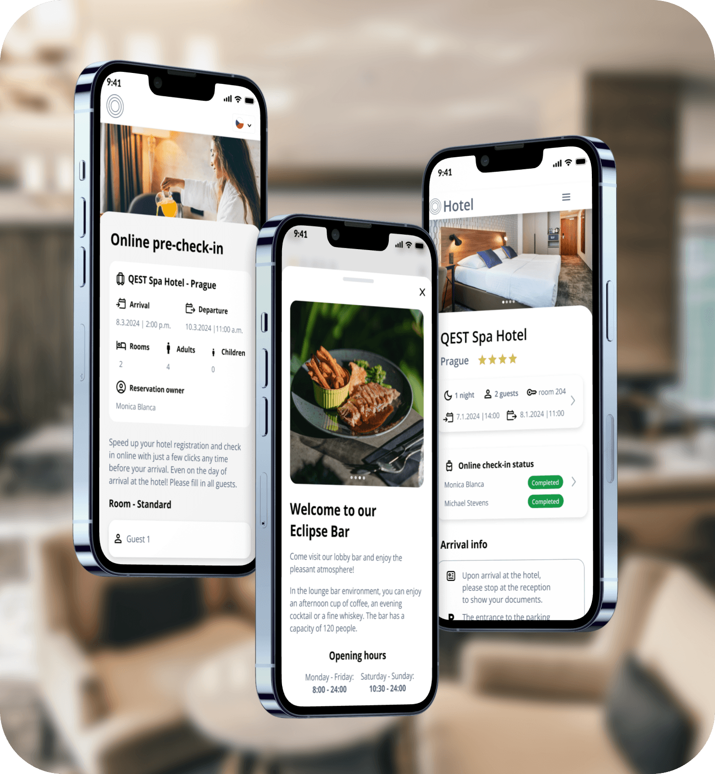
Hotel Reservation System MVP
Between November 2023 and April 2024, I worked as a UX/UI Designer (primarily focusing on UI) on an MVP version of a hotel reservation web application. The goal was to design a functional and visually consistent system for both hotel administrators and guests — optimized for desktop, tablet, and mobile devices.
2026© Alexej choruzij - UX Portfolio
Alexej CHORUZIJ
Senior UX/UI Designer, open to new opportunities.
a.choruzij@gmail.com
Email copied!
Selected projects
Back
Florebal Expert
Redesign of the online store with florball accessories


3 weeks (2024)
Duration
Role
UX/UI Designer
Research
Design system
Low fidelity &
High fidelity
SCOPE
Figma
PS
Tools
Mirandamedia design team
Team
Background & Project Context
In 2024, I worked on a complete redesign and platform migration of Florbal Expert, an e-commerce store specializing in floorball equipment and sports medicine products, at MirandaMedia.
The client’s goal was to migrate the existing store to Shoptet, modernise the UI, simplify navigation, improve category clarity and restructure product filters to create a faster and more intuitive shopping experience. At the same time, we aimed to preserve the brand’s visual identity, built around high-quality product photography and sport-driven aesthetics.
The final design was successfully handed off, and the redesigned e-shop is now live.
Project Brief & Key Challenges
Based on the initial workshop with the client, we identified a number of UX/UI challenges and improvement opportunities.
Key challenges
Preserve the existing visual identity and photography style
Redesign banner system (previous carousels were ineffective)
Unify category and subcategory structure
Simplify filters (max. 8 parameters) inspired by POC
Strengthen brand, technology and ambassador presentation
Add missing UX features (Quick View, Wishlist, product labels)
Design popup cart with dual availability logic
Support both individual players and club/team purchases
Original version of website


My redesign (High fidelity version)

My Process at MirandaMedia
At MirandaMedia, Shoptet e-commerce stores were designed using a consistent workflow. This structured process ensured smooth collaboration and predictable delivery.
Our standard project process
Kick-off meeting with the client (requirements, expectations, platform migration needs, visual inspiration.)
Competitor & benchmark research (for this project, the main reference was POC.com, plus Unihoc, Zone and other sports shops)
Wireframes /UX (starting with the homepage → category pages → product detail → cart. The client had 1–2 review rounds.)
High-fidelity UI design (After wireframes were approved, we created the final visual design. Again 1–2 iterations allowed.)
Developer handoff (Handing over design systems, components, assets and specifications. FE development typically took 2–3 weeks, longer if backend adjustments were needed.)
Final review and launch
For Florbal Expert, communication with the client was exceptionally smooth, which helped us deliver the design efficiently.
Research & Analysis
I began with a heuristic evaluation of the original e-shop and compared it with best practices from modern sports retailers.
Key findings
Navigation and categories were inconsistent
Banners and carousels distracted rather than guided users
Brands and technologies were underrepresented
Product listing pages lacked hierarchy and scannability
Important UX features were missing (Quick View, Wishlist)
New information architecture included:
Key references inspiration included:
POC.com (primary inspiration)
Unihoc
Zone Floorball
Sportega
Top4Sport
Conclusion: “The store must feel expert, clean, trustworthy and sporty — without overwhelming the user.”
POC inspiration


Previous Product section


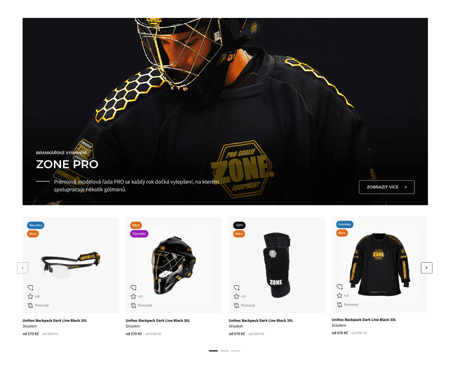
Updated Product section

UX Design — Flows & Wireframes
Information Architecture & Navigation
The first redesign step was to unify all product categories and restructure them according to real user behaviour.
Wireframes
Mid-fidelity wireframes were tested and iterated with the client before moving to the final UI. The focus was on:
visual hierarchy
clarity of categories
simplified filters
better product card structure
improved brand visibility
Visuals: Homepage, Product listing page, Product detail page, Cart — mid-fi wireframes.
wireframe example

User flows
I focused on two key scenarios:
Flow 1 — Player purchasing a new stick
Home → Category → Filters → Product detail → Add to cart
Flow 2 — Club purchasing multiple items with team benefits
Home → Club benefits → Contact / bulk purchase form → Checkout
The goal was to reduce friction, position relevant information higher, and enable quick scanning with clear product logic.
Enhancements included: Quick View, Wishlist, unified product labels, harmonized variants (flexibility, hardness, length).
Visuals: Flow diagram, Product listing page, Product detail page wireframes.
Navigation comparison (before and after)

Product filters mobile example ( (before and after)

Product filter desktop example (before and after)

UI Design
Visual Direction
The visual direction respected the client’s existing aesthetic: dark/light contrast, strong product photography, sporty layout and accent colors tied to major brands. The result is a cleaner, faster and more modern interface that still feels familiar to the brand’s existing audience.
Components & Styleguide
Visuals to include:
Color palette
Typography scale
Buttons & inputs
Product card components
Filter components
Product labels (Tip, Limited, New)
Final Screens
Recommended to show full-width mockups of:
Homepage (desktop + mobile)
Category page
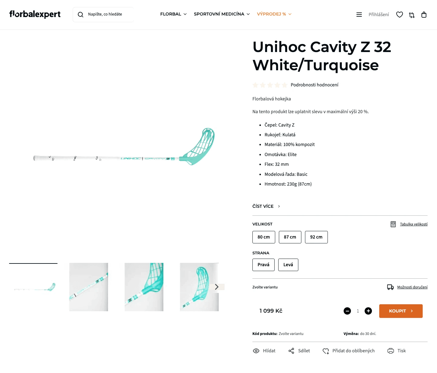
Product detail
Cart popup
Brands page / Technologies page
Ambassadors page
Primary buttons

Product card EXAMPLE

Banner EXAMPLE

Implementation on Shoptet
The final design had to work within the technical constraints of the Shoptet platform. I adapted several areas to fit the platform’s capabilities:
Key considerations:
Banner and slider limitations
Filter structure
Page layouts restricted by Shoptet blocks
Product detail template behaviour
Popup cart mechanics
Product label placement
I prepared a detailed component library and handed off all assets and specifications to the front-end developer. Backend changes were required in a few places, which extended the development phase.
Shoptet customization – footer example


Results & Impact
Although we do not share specific metrics, the qualitative outcomes were very positive.
What I learned:
How to design effectively within Shoptet’s limitations
How to modernize a store without breaking its visual identity
Better structuring of sport-oriented categories and filters
How to design banners that remain visually clean and scalable
Smoother communication with developers and handoff workflows
The project strengthened my understanding of both UX flow design and pixel-precise e-commerce UI.
Impact results:
The client reported much clearer navigation and smoother category browsing.
Banner presentation became visually consistent and easy to maintain.
Customers provided positive feedback regarding clarity and overall modern feel.
The structure now better supports team/club purchases.
The new e-commerce shop operates reliably in production with no UX issues reported.



Alexej CHORUZIJ
Senior UX/UI Designer, open to new opportunities.
a.choruzij@gmail.com
Email copied!
Selected projects
2026© Alexej choruzij - UX Portfolio